Jeannette Watson Sanger case study — Peaceful Media
← All workHealer · Author · Bookseller

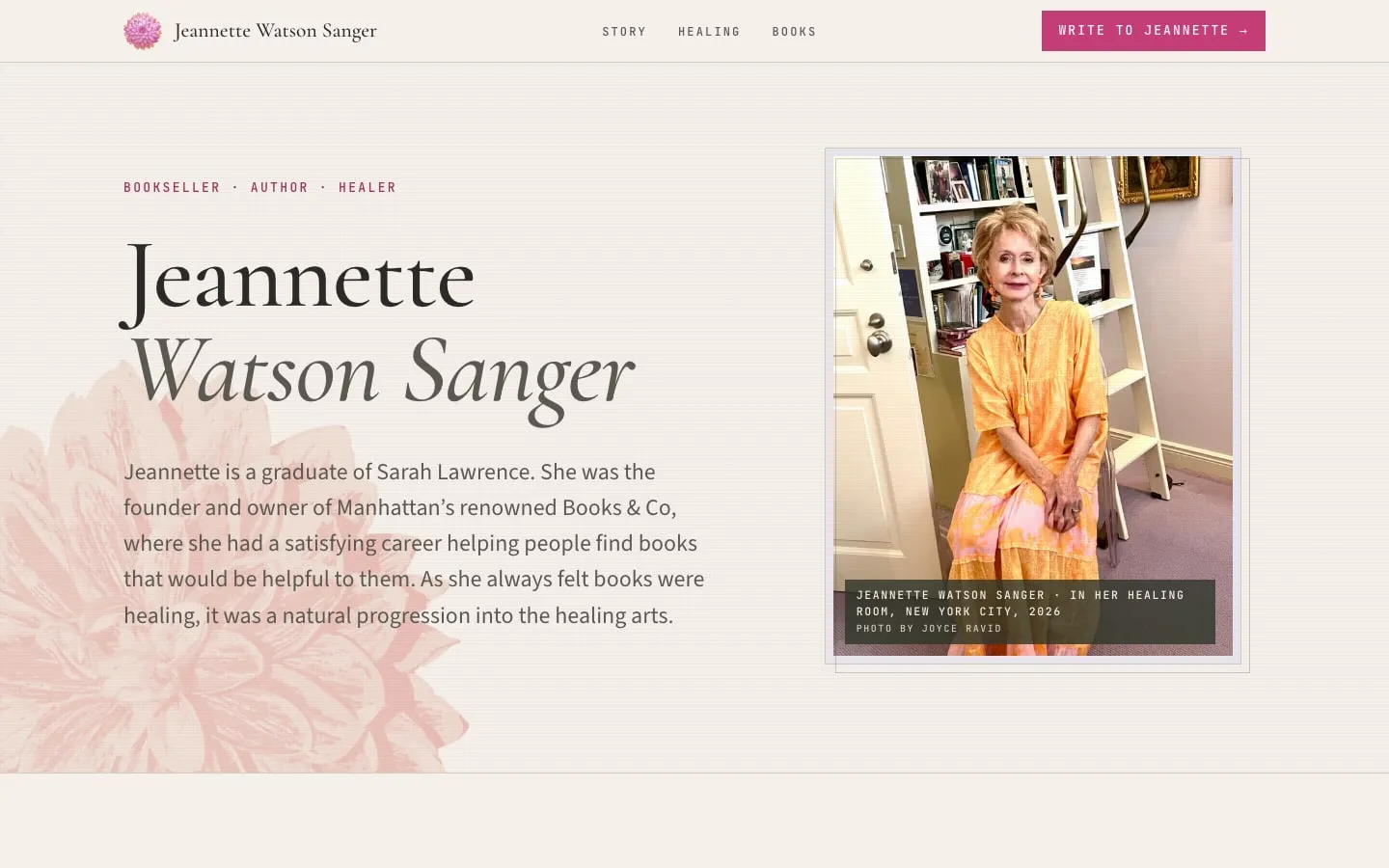
Jeannette Watson Sanger

A one-page calling card for a New York bookseller turned healer

  • 100/100Google's performance score on a budget phone and slow connection
  • 1.0suntil the page shows up on that same slow phone
  • 0sspent ignoring taps while it loads
Jeannette Watson Sanger site design by Peaceful Media
The story

Jeannette Watson Sanger ran Books & Co, a celebrated independent bookshop on Madison Avenue, for twenty years. Today she’s a healer, an author, and a Laughter Yoga leader. Her work comes by word of mouth, so she needed a calling card rather than a sales page: one page she can send to friends, so they understand what she does and pass it on.

The site tells her story in chapters on a single page: the bookshop, the turn to healing, the work itself, her books, and an invitation to write. It’s built around her own photographs, her words, and a mark made from her painted dahlias. It’s fast, readable at any age, mobile friendly, and set up for search.

Results: she approved the final site with no further changes. On Google’s slow-phone test it scores 100 out of 100 for performance and shows up in a second. The site goes live soon at jeannettewatson.com.
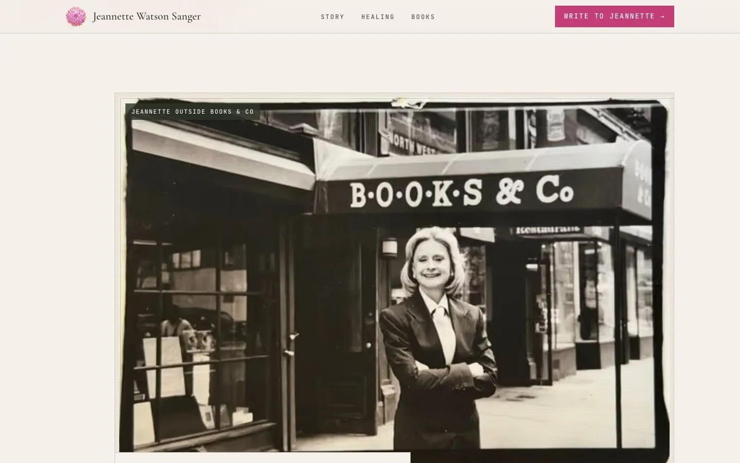
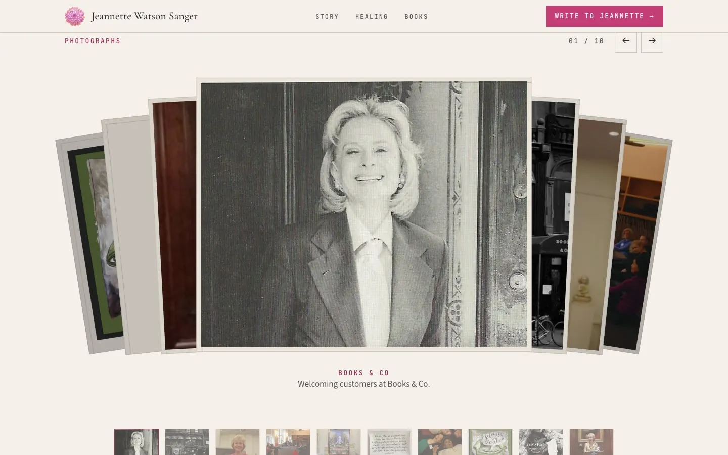
The bookshop chapter: a black-and-white print of Jeannette outside Books & Co on Madison Avenue, with its caption set on the print
The photo album: a fanned stack of prints from the Books & Co years, a caption beneath, and a strip of thumbnails
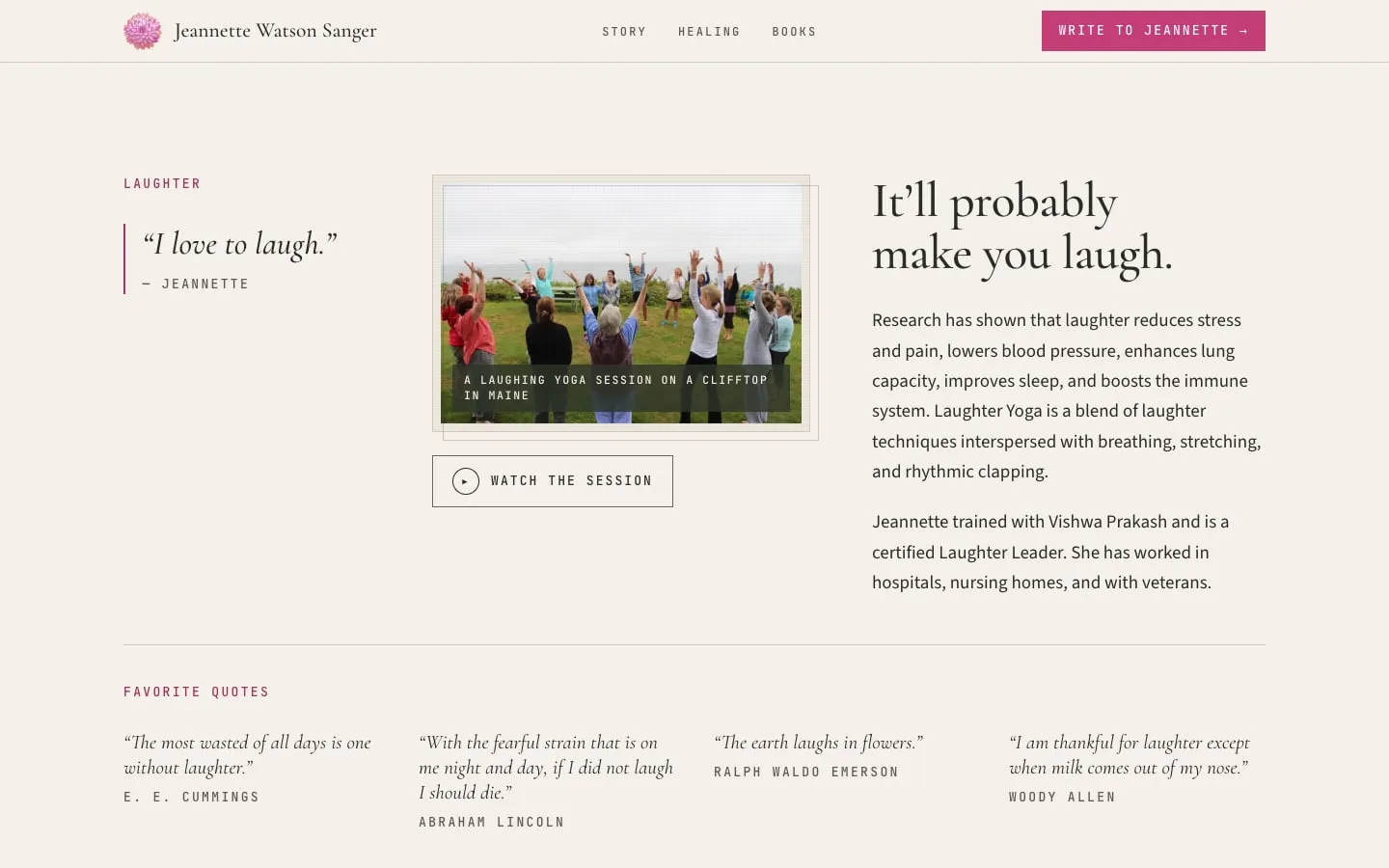
The Laughter section: a Laughter Yoga session on a clifftop in Maine, a film button, and a strip of her favourite quotes about laughing
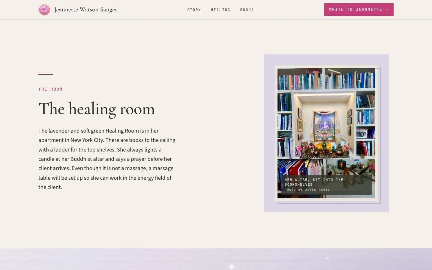
The healing room: her altar set into floor-to-ceiling bookshelves, beside a short description of how the room is used
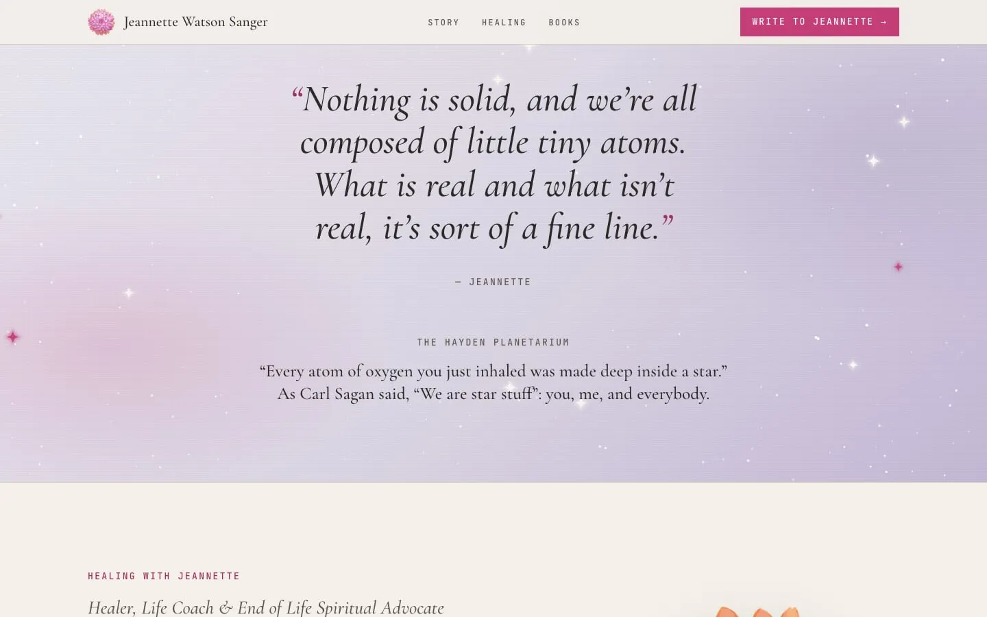
Her own words, "Nothing is solid, and we're all composed of little tiny atoms," set over a lavender star field
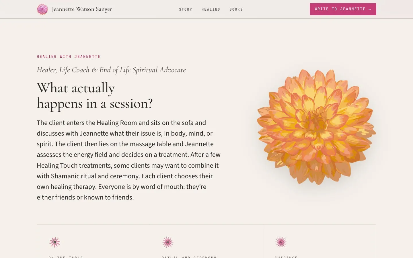
Healing with Jeannette: what happens in a session, in plain words, with an apricot dahlia blooming beside it
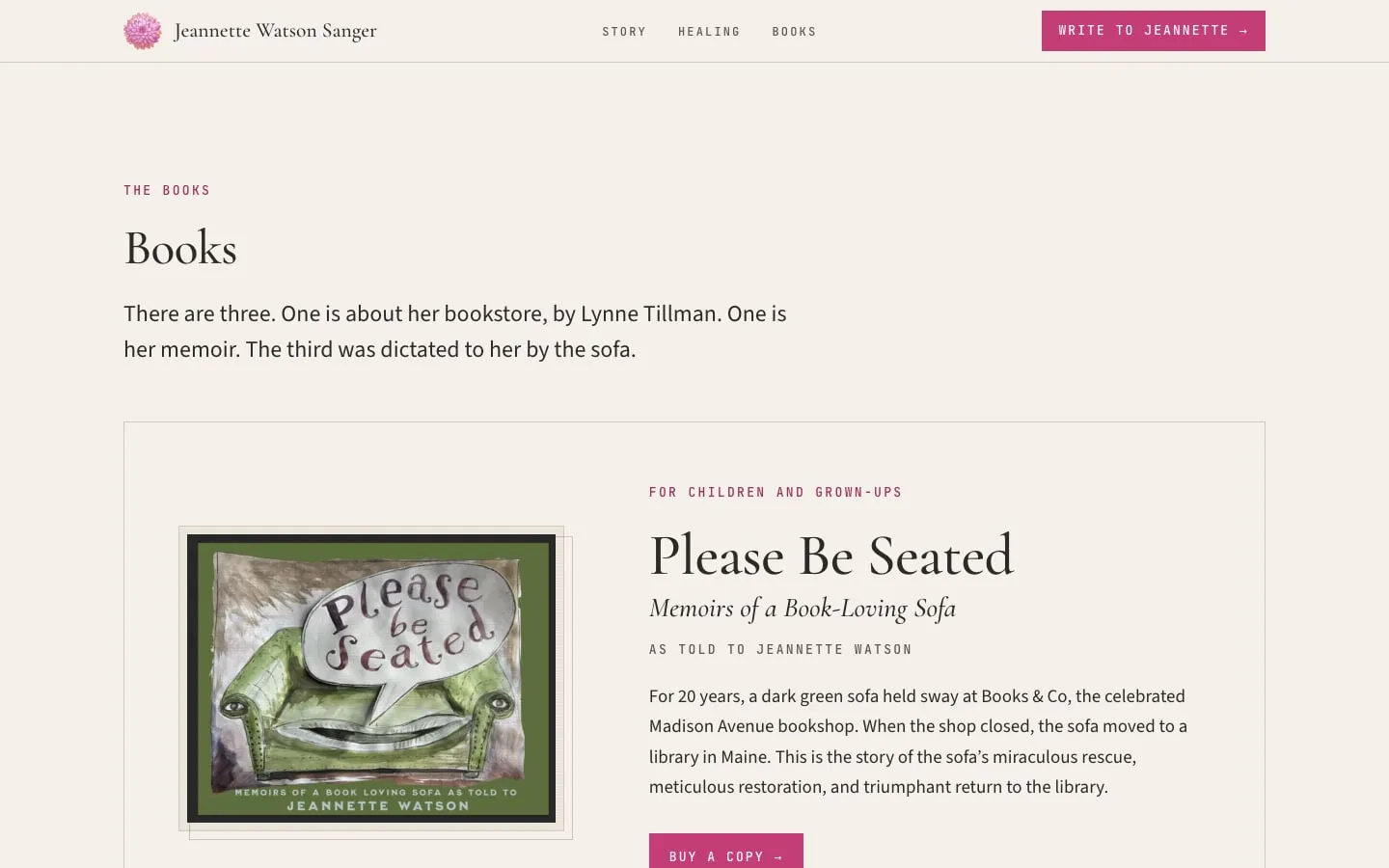
The Books section: her book Please Be Seated, the memoir of a book-loving sofa, with a link to buy a copy
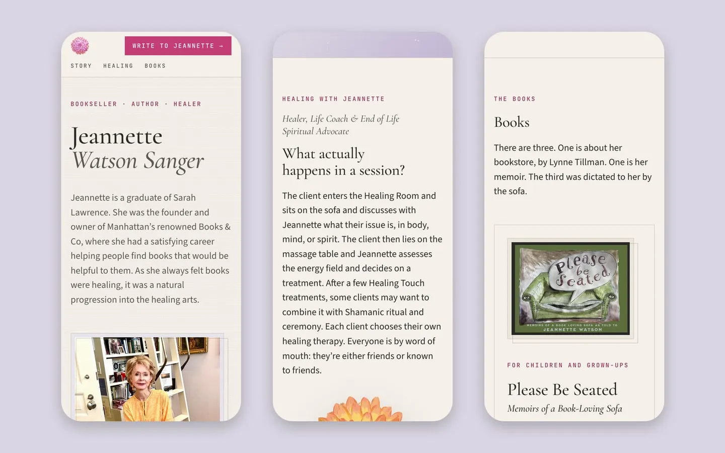
Three phone screens on lavender: the opening with her name and portrait, a session explained, and her books
A few pieces from the work
The full story

Case study details

The brief, the words, the identity, and the build.

The brief

For twenty years Jeannette ran Books & Co, a beloved independent bookshop on Madison Avenue. When it closed she trained as a healer, and today she works with Healing Touch, shamanic practice, intuitive guidance, and people at the end of life. She also leads Laughter Yoga.

Her clients come by word of mouth, so she didn’t need a sales page. She needed something she could send to friends, so they’d understand what she does and pass it on. That set the strategy: one page, a warm and accurate story, and an email link instead of a booking funnel. No prices, no pop-ups, nothing that pushes.

The hard part was balance. She’s a bookseller and author as much as a healer, and she wanted both halves equal. The page had to hold both without reading like two websites.

The package

This is our Calling Card package, made for people who don’t need a complicated multi-page website. They want to tell their story on one page that’s professionally written and designed, fast, mobile friendly, and set up for search.

It covers a brand intake and a discovery session, two drafts of copy, a one-page site with a way to get in touch, mobile-ready design and basic SEO, a review round, and three months of our Care Plan. Jeannette added the premium logo, so the page has a mark of its own instead of borrowing an existing one. No other add-ons.

The words

The page reads as one story in chapters: the bookshop, the turn, the laughter, the healing room, the work itself, her books, the letters clients send afterward, and an invitation to write.

The copy keeps the healing work plain and grounded. A section called “What actually happens in a session?” explains a visit step by step, so a friend who has never had energy work can picture it. Where Jeannette wrote her own lines, they went on the page as she wrote them.

The design

The site is built around her own things. Prints from the Books & Co years carry captions set right on the photograph, and a fanned photo album holds the rest. Her altar in its bookshelf niche anchors the healing room. One of her own sayings sits over a lavender star field.

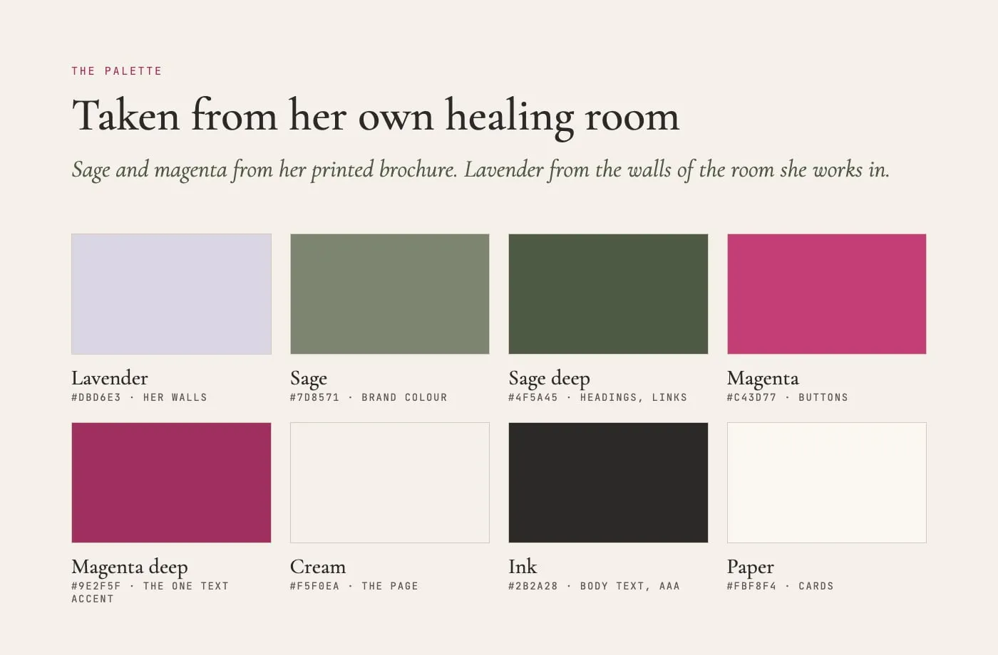
The palette came from her printed brochure and the lavender walls of the room she works in. Her painted dahlias (the logo) appear throughout as the one ornament, blooming as you scroll and opening behind cards on hover. Motion stays quiet and switches off for anyone who prefers reduced motion.

The build

It’s a static site built with Astro: plain HTML and CSS with a few lines of script, so it loads fast and has little to break. On Google’s mobile test (a budget phone on a slow connection) it scores 100 out of 100 for performance and shows up in about a second.

The type is set large and every colour used for text passes WCAG AA contrast, because many of the people she’ll send it to are older. For search, it carries structured data that describes her as a person and a practice, a sitemap, page titles and descriptions, and social share cards.

Results

Rounds of her own edits and new photographs shaped the page into the one she wanted to send, and she approved the final site with no further changes. Her plan is the one the page was built for: send it to friends, ask them to pass it on, and link it from her email signature.

The site goes live soon at jeannettewatson.com. Until then it’s on our staging preview.
Behind the scenes

The identity kit

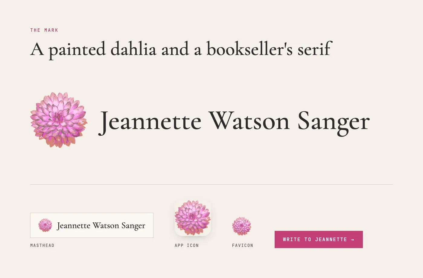
The premium logo add-on gave the page a mark of its own. Her painted dahlias became the logo, the favicon, and the page's one ornament, set beside a literary serif that carries the bookseller half of her story. The colours come from her printed brochure and the room she works in.

The logo: a painted pink dahlia beside Jeannette Watson Sanger in Cormorant Garamond, shown as the masthead, app icon, and favicon
01 the markA painted dahlia and her name in a bookseller's serif. The same flower scales down to the app icon and the favicon.
The palette: lavender, sage, sage deep, magenta, magenta deep, cream, ink, and paper swatches with their uses
02 a palette from her own roomSage and magenta from her brochure, lavender from her walls. The deep tones exist so every line of text passes contrast.
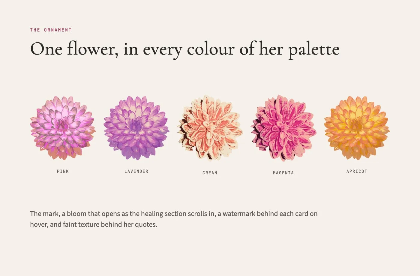
Five painted dahlias in pink, lavender, cream, magenta, and apricot
03 one flower, five coloursThe page's only ornament. It blooms as the healing section scrolls in and opens faintly behind each card on hover.
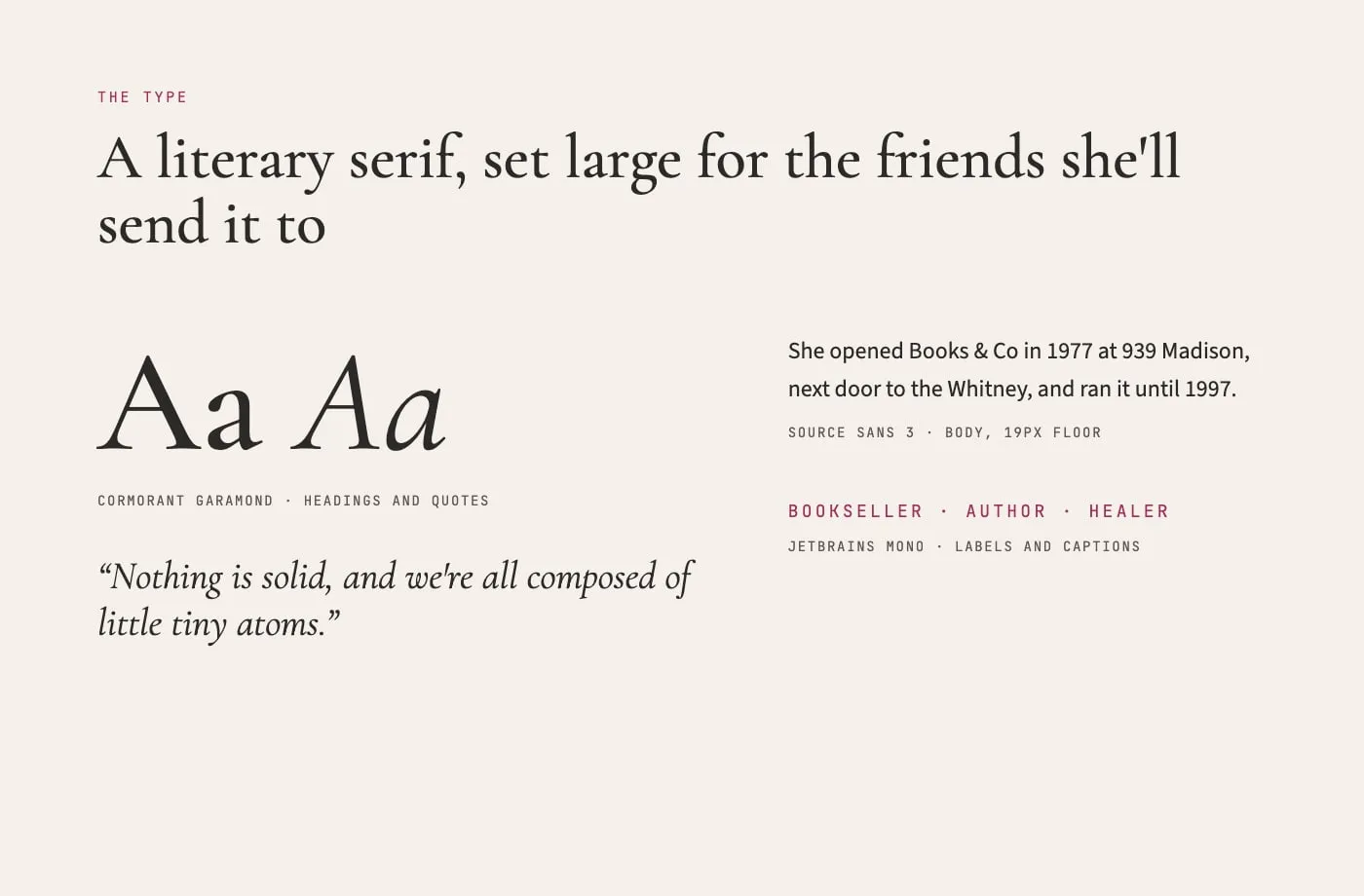
Type specimen: Cormorant Garamond for headings and quotes, Source Sans 3 for body text, JetBrains Mono for labels
04 type with a literary halfCormorant Garamond for headings and her quotes, Source Sans 3 for reading, set generously for easy reading.
Boards assembled from the site's own artwork, colours, and fonts