Want a remarkable look and feel for your website, but don’t have the big bucks for extensive brand development?
We developed a strategic process that has greatly reduced web design and branding costs, sometimes by over 50% for business owners who want a memorable look but don’t have the resources to go deep.
But before we go into the process, let’s back up a step and ask:
What Is Branding?
At Peaceful Media, our simple definition of Branding is the process of communicating what makes you YOU to the world.
When you’re running an organization with abundant resources, you can afford to put a tremendous amount of thought and money towards branding. Not only do you spend a lot to create the brand, but you also protect it, nurture it, and constantly test whether or not your brand communication has landed effectively in your audiences hearts and minds.
This level of branding activity is expensive. Corporations will spend months — if not years — doing a branding or rebranding process. Hundreds of thousands of dollars will go into designing hundreds of logos, taglines, unique selling propositions, and other messaging elements.
[et_bloom_inline optin_id=optin_5]The Challenge For Bootstrappers Who Want A Killer Brand
If you’re a small business owners or entrepreneur starting a new company, you probably don’t have the time or budget for comprehensive, “big company” brand development. But you still want to (and truly need to) stand out. And in order to be successful you still need to find the powerful visual and direct communication that registers a place in your audience member’s consciousness. You just need to do it on a budget.
We’re accustomed to this challenge. Our primary clientele are not fat cats. They’re bootstrapping entrepreneurs and topic experts who are starting up new brands around their personal name. The typical goal is to make our client a well-known, top-of-mind name, even though we don’t have a multi-million dollar advertising budget.
Enter Our Mood Boards Process
Frustrated with not being able to help good people on tight budgets create an amazing, unique, well-branded website design, we were forced to get creative — which is what bootstrapping a business is all about. We had to find more efficient methods to brand someone, make her memorable and professional without spending six figures.
The result is our signature “Mood Board” process which is typically rolled out at the beginning of our design stage. Our brilliant designer and creative director, Rae, created the process, so I’ve asked him to describe it in detail. Here are our interview notes:
First off, what is a Mood Board?
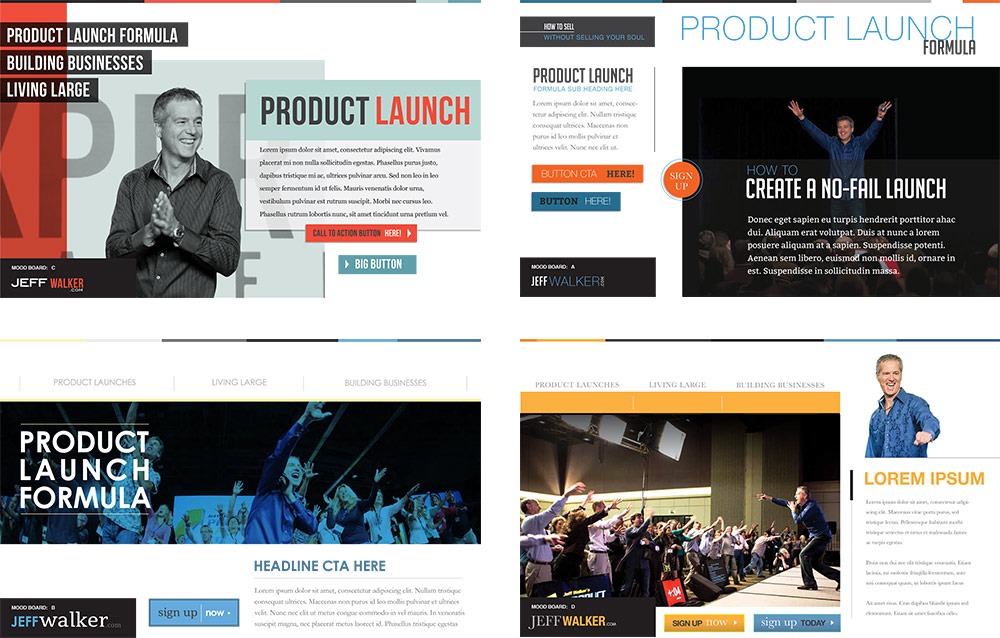
The easiest way to define a Mood Board is probably to show some examples. Here are the four Mood Board options we presented to Jeff Walker when we were in the early stages of rebranding and designing his website JeffWalker.com:
As you can see, Jeff was given multiple, unique approaches to communicating his brand message. Each one could independently work for his target audience, but each option accomplishes a different feeling or tone. Hence the term Mood Board.
What inspired you to use the Mood Board process?
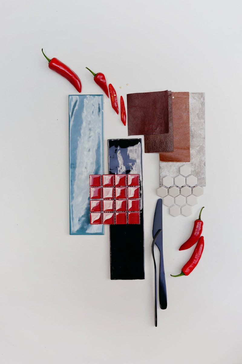
I stole this idea from interior designers and landscape architects, who both use Mood Boards to show, for example, paint swatches, fabric swatches, drawings / sketches to discuss their proposals before beginning work. I think this is really useful with website design and branding work because by using elements that all websites need (buttons, photos, fonts, color pallet, etc.) we are able to focus on those elements and the feel that they give together without getting bogged down in the actual design of the website yet. It gives me flexibility as a designer to allow the client room to pick and choose items from different mood boards that they like. Then it’s my job to create a final Mood Board that includes the elements the clients chose and creates a cohesive branding board. Because the vast majority of our clients do not need a logo design, we don’t have to start there, which is where most design agencies will begin. That process is typically a long and difficult one that can cost a lot of money. By using type-based logos, we are cutting out a very large chunk of cost for folks and we can jump right in to the look and feel of the brand.
How would you describe our web design process before you discovered / introduced the Mood Board process?
Slower, which equals more cost for the client. I have been searching for a way to be efficient while establishing the brand look and feel, and Mood Boards are a great tool for getting that ball rolling. Before using Mood Boards, I did what I was taught in school and what just about every other design agency out there does, which is to start with the logo. This process is not only expensive, but it’s also often difficult for the client to not become impatient and frustrated. Clients don’t understand why logos take so long and why it’s costing them so much and slowing down what they want, which is the website. We do still design logos for folks who need them, but getting the design process under way with the Mood Boards helps kickstart the project and gets the client excited about their branding. Then we can spend more time on their logo, because they can see the ball rolling forward with the design of their site in the mean time.
What is the Process?
Step 1: Kickoff design meeting where our designers go over visual examples that the client chooses, discuss color, feel, etc. We also discuss their target audience(s), their business aspirations and goals and how they want to be perceived in the world.
Step 2: Initial Mood Board designs are created and presented to client. The Mood Boards include the following:
- Color Pallet
- Font options (for Headline 1 and Headline 2, paragraph 1 and paragraph 2)
- Photography sample
- Button style
These Mood Boards will all be appropriate to the client’s target audience(s) and to the client’s desired perception. Though they will be as diverse as possible within this narrow window of appropriateness.
Step 3: Feedback meeting to discuss the initial round of Mood Boards. Client is welcome to send written feedback prior to the meeting if that is useful to them. Usually this meeting takes about 15-30 minutes.
Step 4: Mood Board Revision Round in which our designer takes the information gathered in the feedback meeting and creates a new Mood Board. This version combines the various elements the client likes into a cohesive new design. New Mood Board is presented to client.
Step 5: Feedback meeting to discuss Revision Round. If there are any further changes requested at this point, then a new Revision Round will take place. If there are only very minor changes requested, they will be discussed and incorporated into the Final Mood Board.
Step 6: Final Mood Board is created and presented to the client and subsequently given to the developers to begin development work. The final mood board includes all color palette information in RGB / Hex # form plus font selections.
Further Steps: Depending on what the client is coming to us for, this could differ. But typically clients come to us for website design and implementation so the next step from here is to take the Final Mood Board and begin designing either the Home page of the website or, at minimum, the Homepage Masthead design. Then the rest of the website design commences from there.
As you do your first Mood Board review call with the client, what are you listening for and how do you synthesize that feedback for Revision Round?
We talk a lot about how, when you land on a website, you have mere seconds to grab attention and to provide a mood or a feel to the viewer. When looking at these Mood Boards, even though they are all using the same general elements (color, type, photography, buttons) they offer a very different feel. That feeling produced is immediate. I make sure that all of the Mood Boards are appropriate to the client and to their target audience, so the choice becomes more about tone, feeling and instinct. The client needs to attract their target audience, but they also need to be enthused about their brand and really resonate with it. Using the Mood Boards, we discuss what’s resonating with them and what’s not and why. Very often, the clients like one of the Mood Boards best (out of 3 or 4 options) but they like small elements from other Boards. So we discuss this and then I take that feedback and go back to the drawing board to come up with a new Mood Board that incorporates all of the elements that resonated. In the design world, a lot of designers complain about clients wanting to piecemeal or Frankenstein designs together. Some designers will even refuse to do so. We not only don’t complain about this, but we expect clients to want to do this. The Mood Boards are designed to allow them to do this. This does not mean the client is dictating the design. Rather, it gives them some room to have opinions and help to shape this brand that is, in fact, theirs. If they choose elements that really don’t go together, then I’ll ask them more questions and find out what it is that they like so much about these clashing elements so that I can find a way to create a design that works. Sometimes, if a client is really set on, say, a color palette that just isn’t appropriate for their target audience and the brand that I am trying to help them create, then I will discuss with them why what they’ve suggested won’t work and how we can move forward with something that will work.
How much has the Mood Board Process cut down on our custom website design budgets?
I think it cuts our discovery process (of the brand) in half at the very least. More likely, I think it actually reduces time and cost by probably 75%. Meaning, it now takes one quarter, perhaps less in some cases, of the time and money that it would were we to do this in a more “traditional” way.
Conclusions & Takeaways
- Branding does matter, especially in a world where homogeneous, template-driven websites are a dime a dozen and your business certainly isn’t just like everyone else’s.
- You have 7 seconds or less to make an impression on your website visitor. Great branding accomplishes this.
- You CAN create a uniquely flavored, remarkable brand experience on your website without spending traditional brand development expense.
- To reduce budget, ask your web designer to try using our Mood Board Process in the earliest stages of your project. If nothing else, the process will allow you to determine if the designer has the chops to correctly communicate the essence of you and your business’s unique qualities.
What about you? Connect with us on social to share your aha’s, insights, and personal experiences with the web design process!
